ACCESSIBILITY · UPDATED 21 OCTOBER 2026
How to Build an Accessible Color Palette: Roles & Contrast
How to move from five beautiful swatches to readable, usable color pairs.
A palette can contain attractive colors and still fail when applied to a real interface. Contrast belongs to a pair of colors, a text size and a usage context. It does not belong to a palette in isolation.
1. Assign a job before judging a color
Start with the surface and the body text. Then choose a primary action, secondary accent and decoration. In Palunio, open UI preview to assign these roles. The preview is a useful sketch; it does not certify a finished website.
2. Check the exact foreground and background
For WCAG 2.2 AA, ordinary text needs at least 4.5:1 contrast. Large text needs 3:1: that means at least 18 points (24 CSS pixels), or 14 points (about 18.67 CSS pixels) if bold. At AAA, those thresholds become 7:1 and 4.5:1. Do not round a ratio up to claim a pass. A measured 4.499:1 fails 4.5:1 even if a display rounds it to 4.50.
Try #777777 on #FFFFFF in the contrast checker. Its ratio is approximately 4.48:1: close, but not a pass for normal AA text. Use the repair action to find a darker option.
3. Repair thoughtfully
Palunio searches lightness while retaining OKLCH hue and reducing chroma where necessary. The repair is checked again after conversion to 8-bit sRGB. This is a practical suggestion, not a claim that it finds the perceptually closest possible color. Sometimes the better design decision is to change the surface or use a different role.
4. Test more than the default state
Test hover, focus, selected, error and disabled states in your actual product. Essential non-text controls and graphics can require 3:1 against adjacent colors under SC 1.4.11. Color must not be the sole way to communicate information. Add text, shape or icons. A simulation helps you notice problems, but it is not a substitute for testing with people.
Scope: Palunio calculates opaque sRGB pairs. Transparency, photography, gradients, anti-aliasing and layered backgrounds need additional checks in their final rendered context.
Primary references
W3C: Contrast (Minimum) · W3C: Non-text Contrast · W3C: Use of Color
Try a pastel palette with real text roles
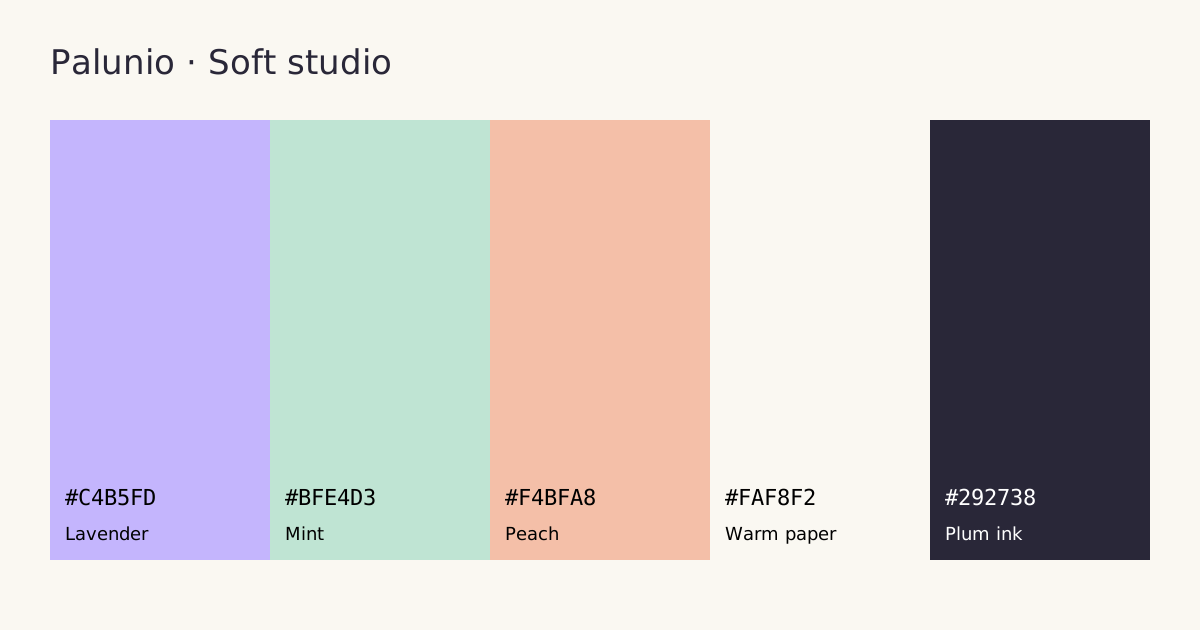
In Soft studio, plum ink #292738 on warm paper #FAF8F2 measures 13.72:1. Lavender is a supporting fill, not a substitute for dark body text. Test an input boundary, a link and a focused button separately: a passing paragraph does not prove that the entire form works.
Download the worked example. Read the file alongside the role definitions before applying it in a project.